By The Minimalist Society
Mindfully Made
Thoughtfully designed, meticulously crafted.
HOME OF C + M
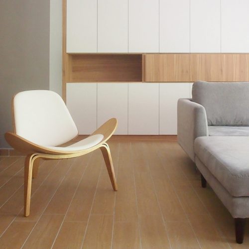
The client chanced upon The Minimalist Society on Facebook as he was searching for Muji interior inspirations for their home. The works we’ve done and the direction we envisioned for their place was well-aligned to what they were looking for.
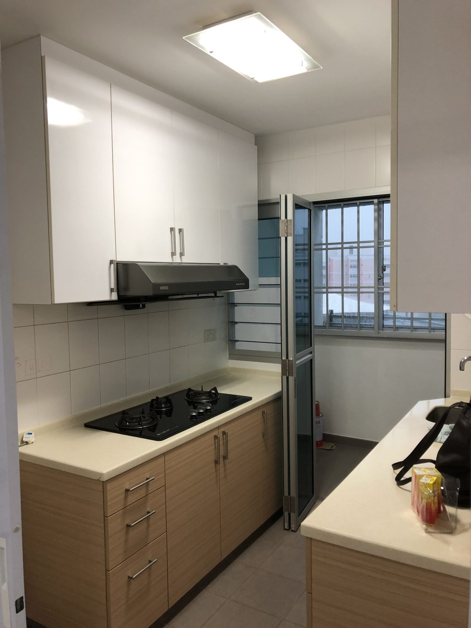
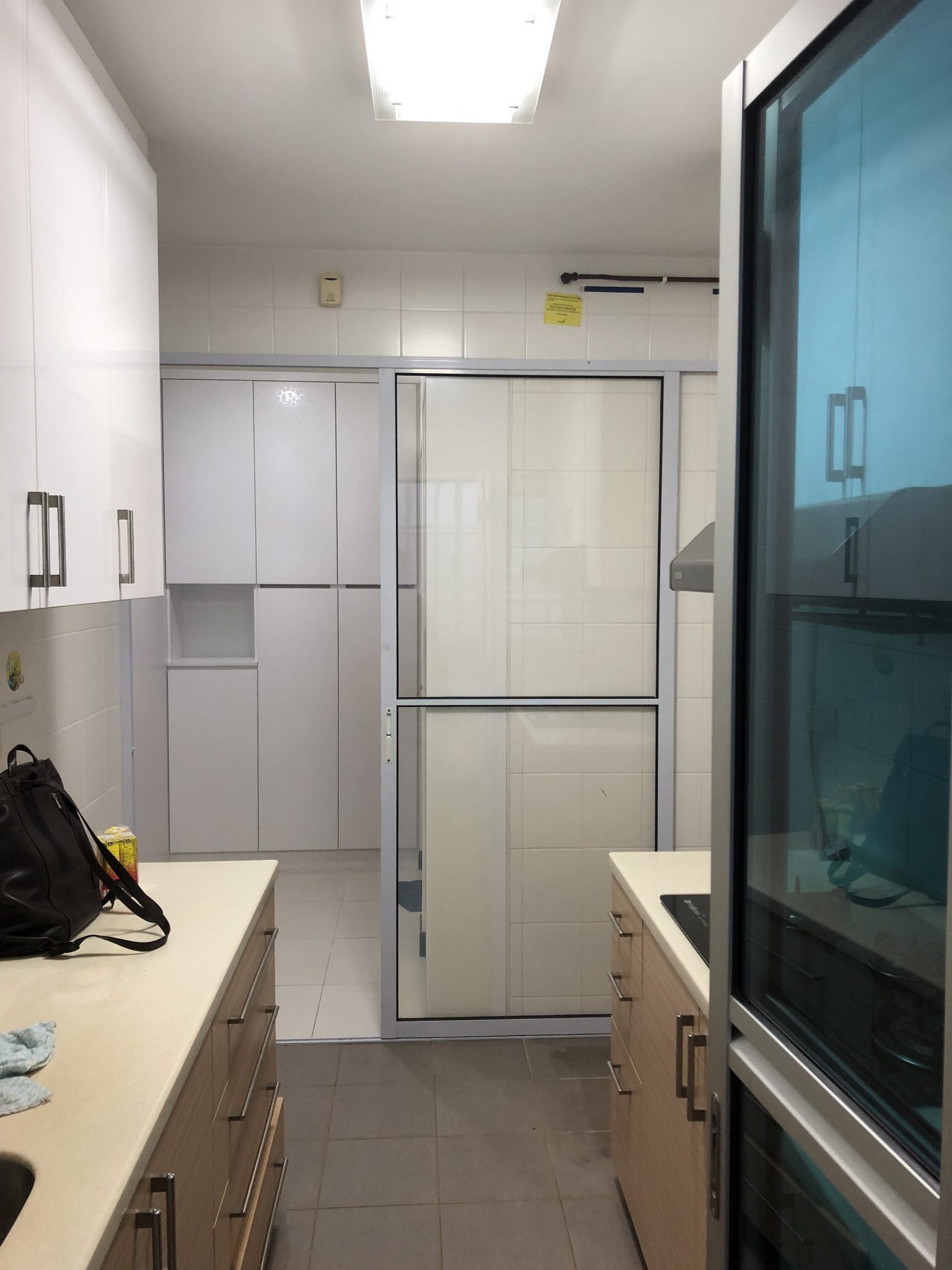
Before Renovation: Some Pain Points
- The existing kitchen was dull looking & unwelcoming.
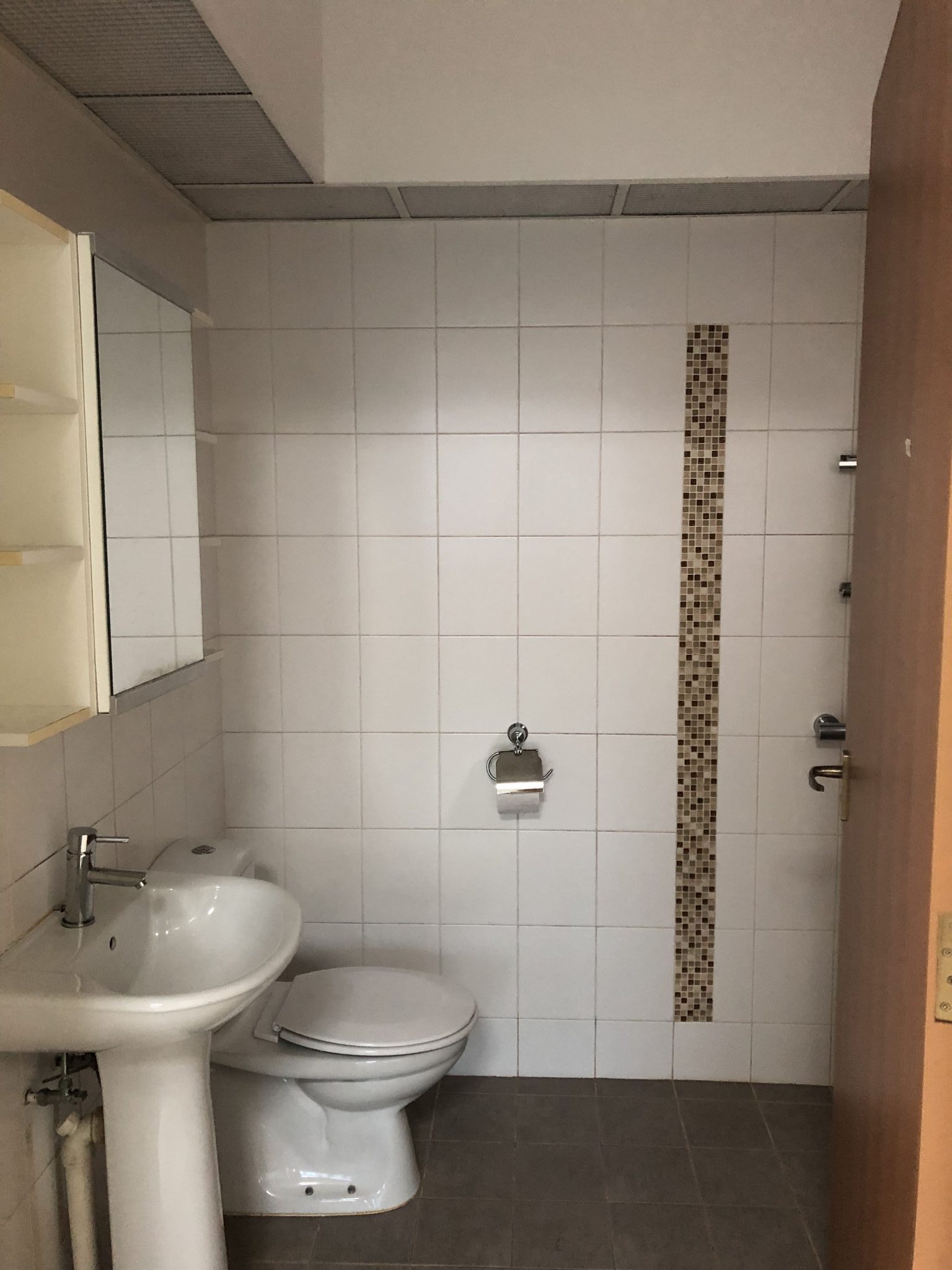
- Bathrooms had odd growths and odours
- Existing discoloured materials showing signs of water leaks
From Homeowners: Renovation Requests
- A muted colour palette overall
- Remodelling of the toilets
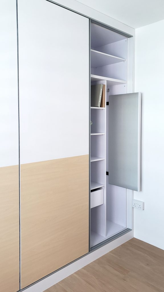
- Needed a full-height cabinet to stow away the shoes
WHAT WE DID
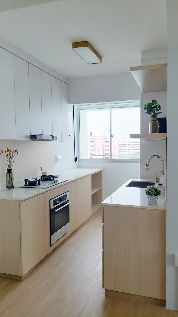
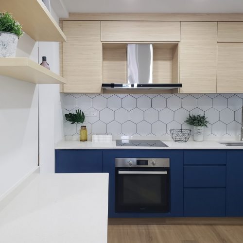
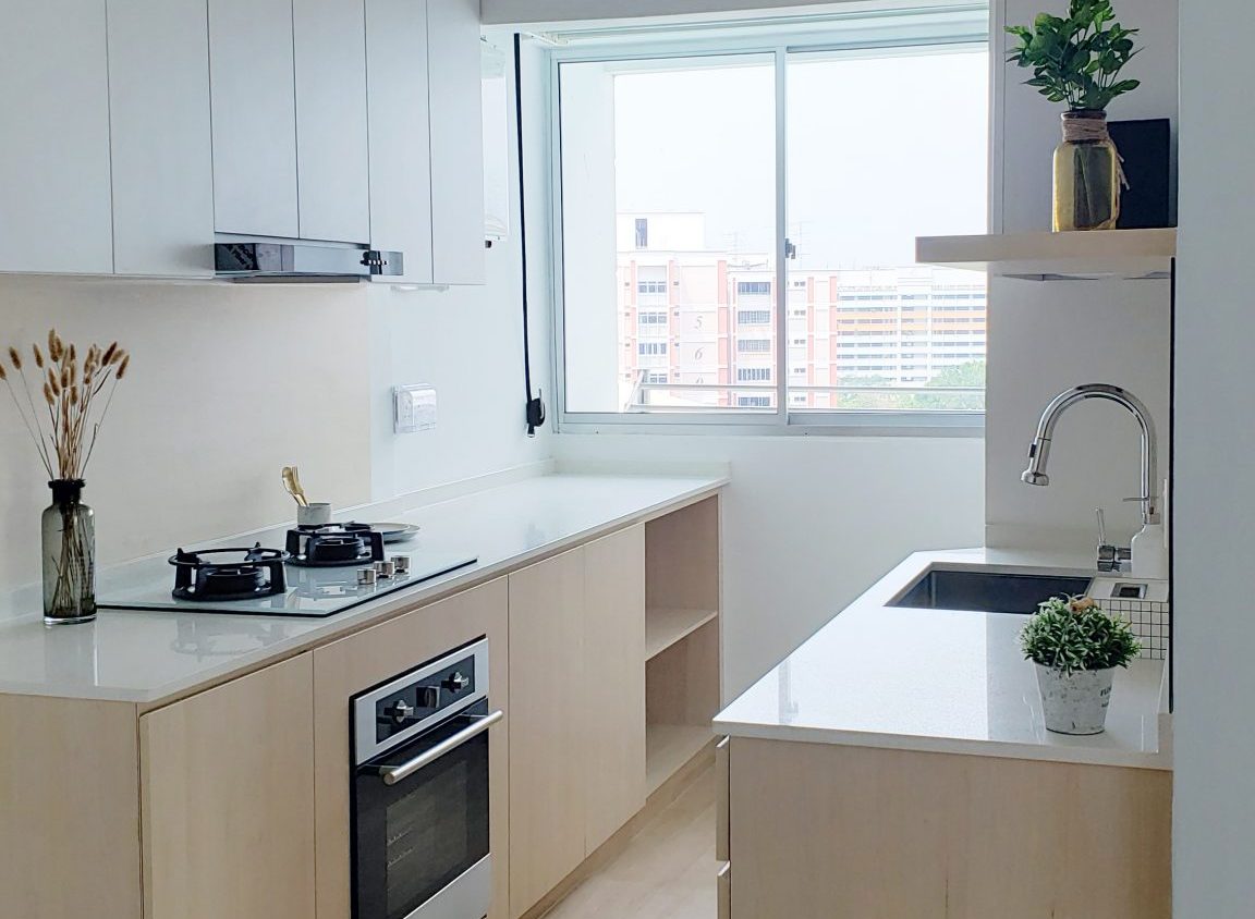
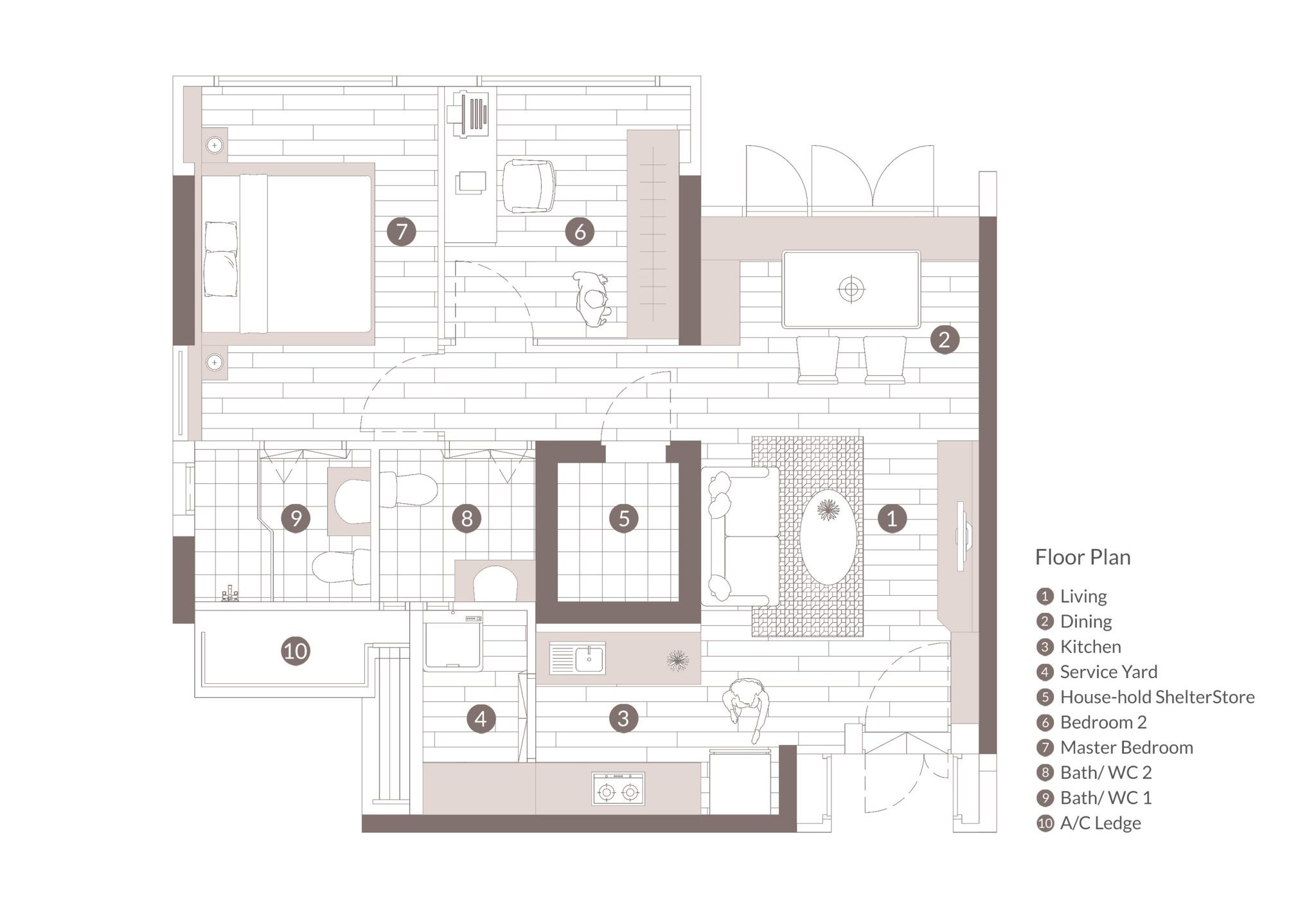
As requested, we wanted to ensure that the family has a food haven for them to enjoy making and cooking delicious recipes. We expanded the space by taking down the service yard window and merging it with the kitchen. This added more area for storage and created more counter space for the homeowners.
AFTER RENOVATION
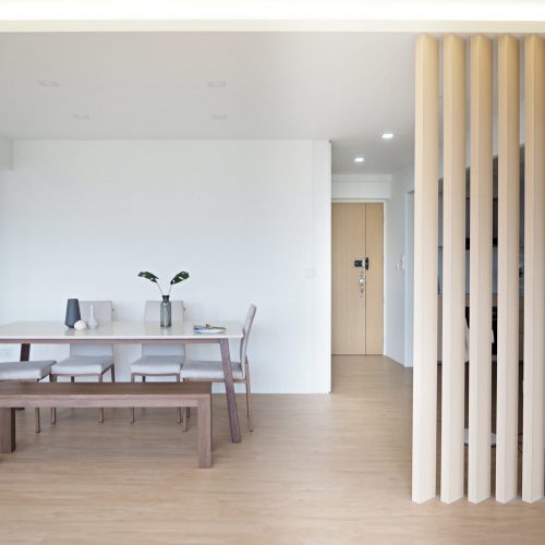
We are delighted to say that the homeowners are pleased with the design transformations. They get to come back to a bright and spacious house, which definitely brings a smile to their faces.


