House Tour: Alicia's Bright Scandinavian Minimalist Condo
Soak up Nordic inspiration from this renovated condo unit in Robertson Edge.

When Alicia, a 29-year-old investment analyst, purchased a 531-sq.-ft. one-bedroom condo unit in Robertson Edge, she decided she wouldn’t stick to the condo’s default interior design…and had The Minimalist Society come up with a better, brighter layout. “Given the small area, I was most focused on maximising the amount of space I had and also making the place look as spacious as possible by keeping the design clean and minimal,” says Alicia.
The designers from The Minimalist Society, add: “The living room was dimly lit and the space was really tight for the bedroom, kitchen, and gym area. We had to ensure we meet the needs of the owner while achieving the aesthetics.”
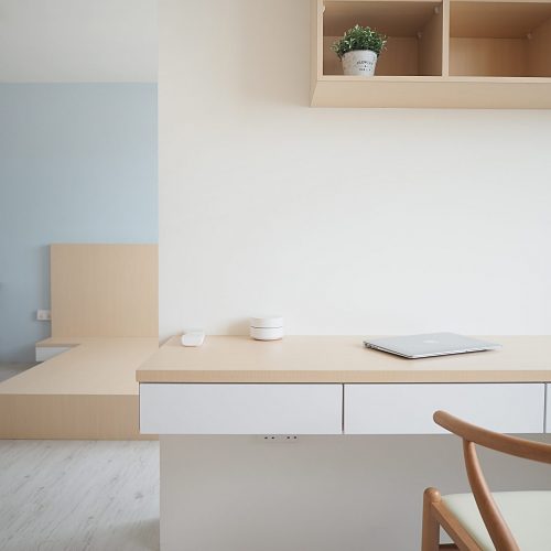
Today, her home stands as a dreamy Scandinavian minimalist abode that feels light and open, looks bright and enviably liveable—plus, “it looks way bigger than it actually is,” Alicia says. Light wood flooring, immaculately white walls, functional pieces, and personal accents contribute to the home’s refreshing look.
Check out her condo unit here:
Living Room


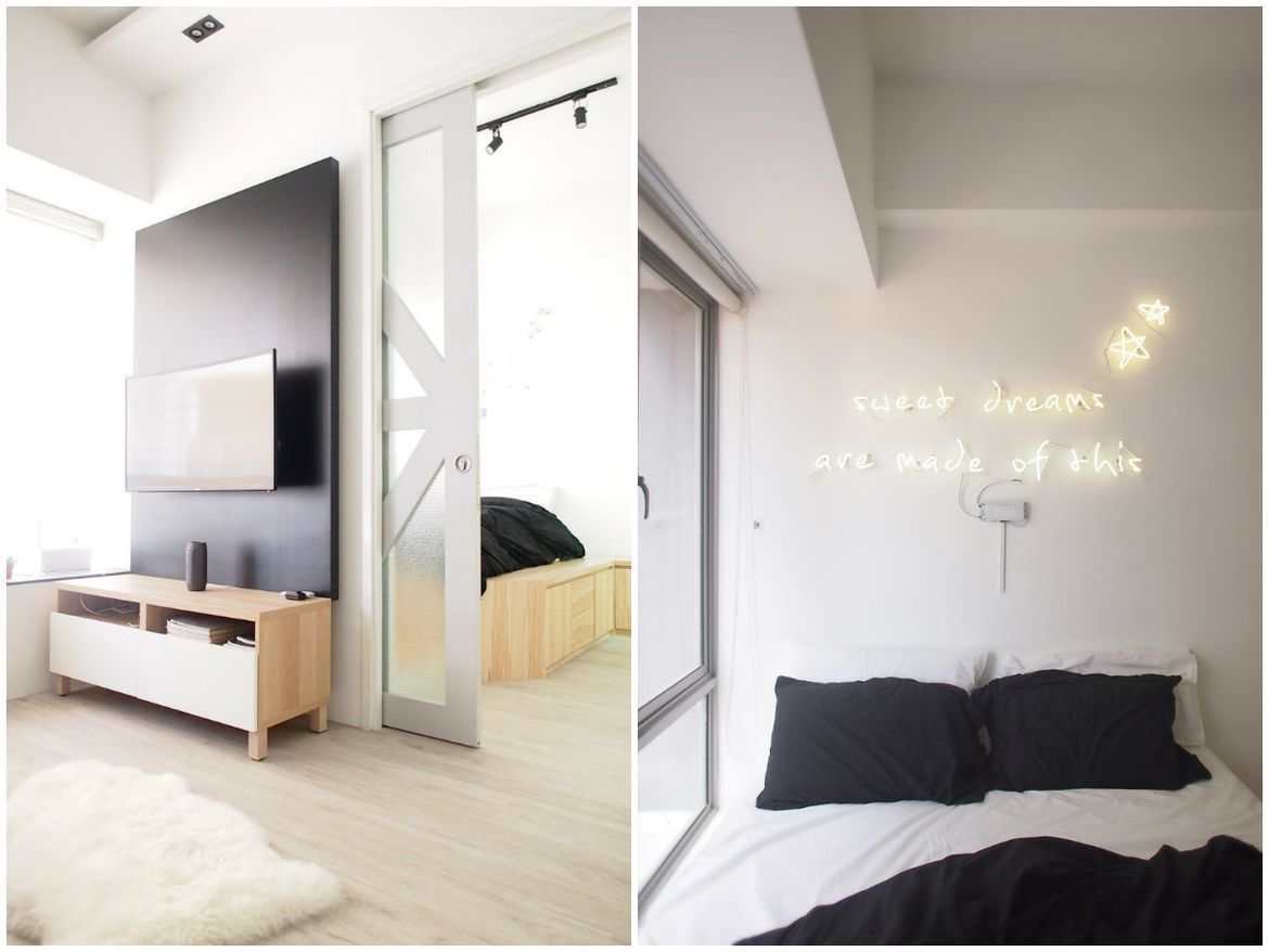
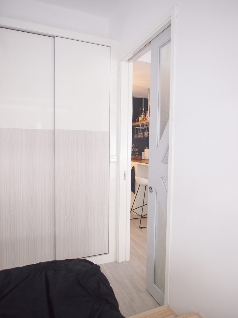
True to the norm of Scandinavian interior design, the living room is kept simple and understatedly stylish, featuring a grey canvas sofa fronting a matte black TV wall and wooden console. White fur rug adds a hint of luxury to the light wood flooring. Adjacent to the TV wall is the glass-paneled barnyard door that opens to the bedroom.
Bedroom

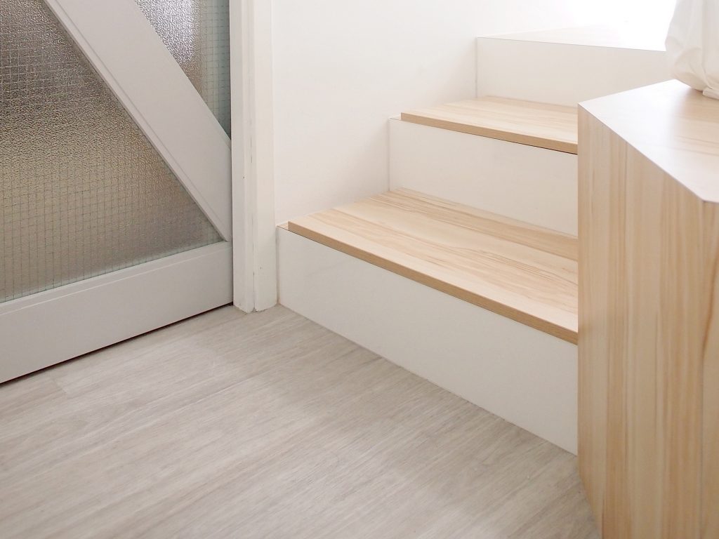
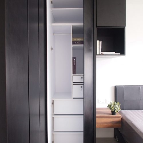
The highlight of the once-cramped bedroom is the raised bed frame that comes with a short flight of stairs and under-the-bed storage drawers. Team Minimalist recalls, “We could’ve made it simple and made a normal raised bedframe; however we anticipated that storage space is almost non-existent or possible in other areas of the home if we would not create it in the master room. Hence, we brainstormed and rigorously planned to come up with a design that allows comfortable walkway, ample storage, and a cosy corner to rest in after a hard day’s work.”
Get minimalist home inspo and renovation tips from us. Be in the know with our latest happenings.
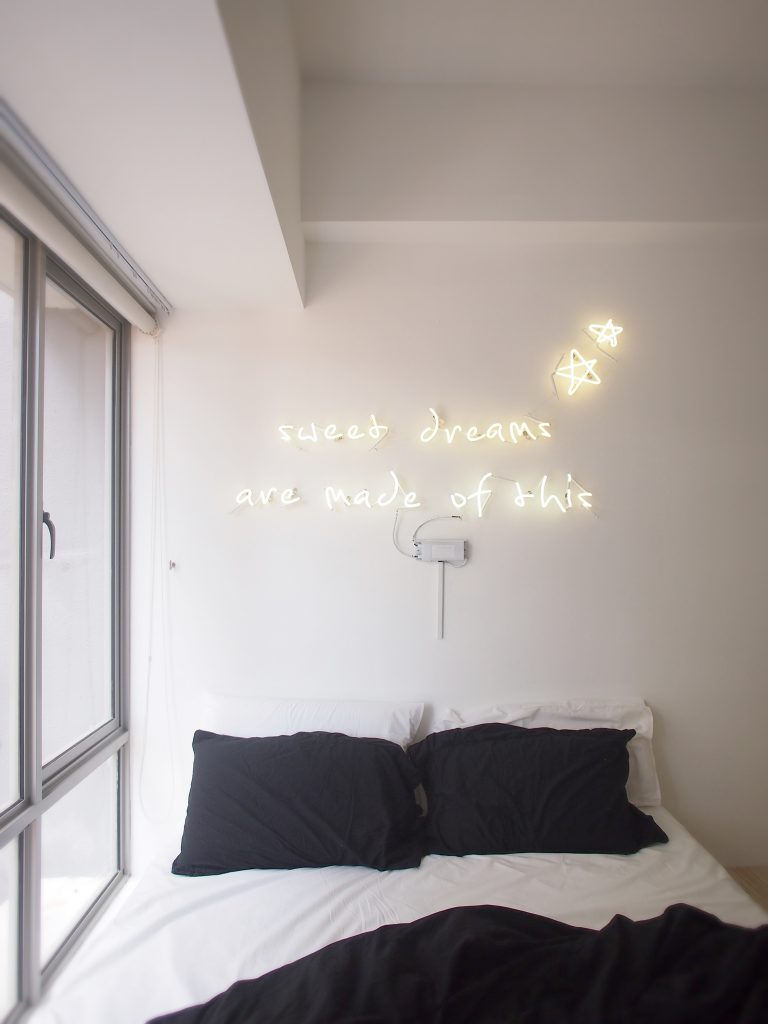
Alicia’s platform bed looks deliciously inviting. The lit-up sign on the wall functions as a quirky accent in this predominantly black and white minimalist bedroom.
“The bedroom is amazing for the amount of storage space created by building the bed over the bay window,” Alicia adds.
Dining Area and Kitchen
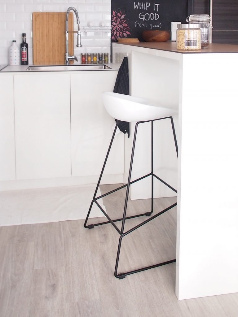

The combined kitchen and dining area may be small, but each corner is efficient and hardworking. Alicia notes, “The kitchen, while small, is extremely functional and I’ve managed to cook up many feasts in it!” Quirky knickknacks and decorative accents like the cage ceiling lamp and chalkboard wall give this tiny kitchen a big personality. The bar countertop serves as dining area and prepping space.
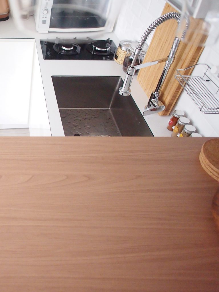

“The hanging bar from the ceiling is also a great way to display my favourite bottles of spirits while keeping them within easy reach,” Alicia adds.
Mini Gym
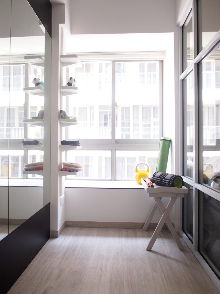
The study area was transformed into Alicia’s mini gym, which features a floor-to-ceiling mirror and her exercise paraphernalia. “I love my mini gym room, which was initially an enclosed study that looked small. However, I was able to transform it into a mini workout area and the introduction of glass and mirrors made the entire living area look bigger.” The gym sits at the back of the living room, with a glass window looking out into it.
The two-month renovation was quite uneventful, and Alicia’s just too pleased with the results. “Overall, the colour scheme feels very cosy, and the apartment is a great joy to return to after a long day.”
Adds Team Minimalist, “We created a chic and functional space that reflects Alicia’s bubbly personal style. Together with her selections of artful accessories, thoughtful details, and fabulous fabrics, we are glad to transform the loft into a serene, pretty retreat that our self-made lady could escape to at the end of a busy day.”
Renovation Details
Type of property: 1-bedroom condo
Total space: 531 sqf
Interior designer: The Minimalist Society
Budget: $40,000 for renovation
Time to complete works: 2 months
Renovation tips for homeowners:
- Go for form and function. “Always find a balance between form and function but at the same time never compromise on your aesthetic and [know] what you want your place to look like,” says Alicia.
- Mind the space planning. Team Minimalist offers this advice: “Space planning is a critical step that is often overlooked or done purely on the floor plan by most people, from the walls that you would like to hack away to how you could make your kitchen as ergonomically friendly as possible. First impressions are created from good design, but lasting impressions are uncovered with thoughtful space planning on site.”

Interview By Samantha Echavez
Like us on Facebook to see our latest portfolio.
The Minimalist Society is a brand that focuses deeply on purpose and social good for our society at large. We do so by crafting experiences that makes people’s lives simple through interior design. We have been featured extensively by renowned online portals, in print and on screen, such as The Straits Times, Business Insider, Lianhe Zaobao, The Business Times, Singapore Home and Decor, Lookbox Living, Houzz, Cromly, Qanvast, Vulcan Post, Yahoo and MM2 Entertainment Singapore. At Team Minimalist, simplicity is a goal, a work style, and a measuring stick. By leading a life of purpose, our home owners can embrace only on the things that will add to the mission of significance and ultimately living their best story.


