The Anatomy of Space Planning
Space planning is the core of any interior design. It can have a very strong impact on the success of any room. Having a good knowledge of built-up carpentry and space allowances are critical in doing good space planning. Think about how all the objects within are arranged, the furniture, the appliances, decorative objects, the lighting and even its colour. Is there any part of that room that feels beyond your reach or awkward?
All rooms/enclosures are first and foremost functional spaces, in which we live, eat, entertain, sleep, read, dress, bathe or just sit. Without proper planning, a room can end up looking awkward or even worse very distasteful. If the room does not meet its first critical criteria of functionality – it really won’t matter how beautiful it looks!
Space planning starts with an in-depth analysis of how the space is to be used. The designer draws up an initial plan that defines the zones of the space and the activities that will take place in those zones. This plan will also define the circulation patterns that depict the flow of movement through that space. This is now complemented by adding details of all the furniture, equipment, hardware, decor and accessories.
In planning for a space, there are 20 points that we take into consideration, 12 of which are shared below:
1. Firstly it’s about imagination, think about the structure of the room and what the main focal points are. These could be windows, doors or built in carpentry units. Are they visually balanced in the room? If not, think about what you can add to the space to help create some balance in the space. Remember that the human eye is drawn to focal points, and will scan a space once it enters into it.
2. Perception of space is relative to individuals so planning should be done based on core functionality of that space and then the preference of the homeowner. Different size spaces suit different people: one person’s claustrophobic box is another’s cosy nest. One example could be the space allowance allocated for walk-in wardrobes.
3. Think about the space as a naturally blank habitat and all objects coming in to fill it up are disruptions to it so you have to maintain balance, for instance, will adding a sofa, bookshelves, table, coffee table etc, make it less of what it is. Make sure that you don’t overfill the space, less could mean more!
4. Aim to create both a prospect and a refuge in each room so you can feel enclosed, but also have a view beyond to the outside or natural world. Using Prospect and Refuge theory in a space can make it more comfortable for the human experience. Humans by nature would prefer a shelter (refuge) with a view (prospect), because humans have their field of vision to the front (prospect), therefore needing some sort of protection from behind (refuge). This is especially useful for the positioning of bedframes or study desk.
5. Plan your furniture with actual demarcation of their space at the home. Work out the best possible arrangement of potential furniture and accessories.
6. Ensure that there is symmetry of passageway flow from both directions; navigation should be as easy as possible from the entrance to all the other main activity areas within that space.
7. In large or long spaces, subdivide different activity zones to give definition to each part of the room.
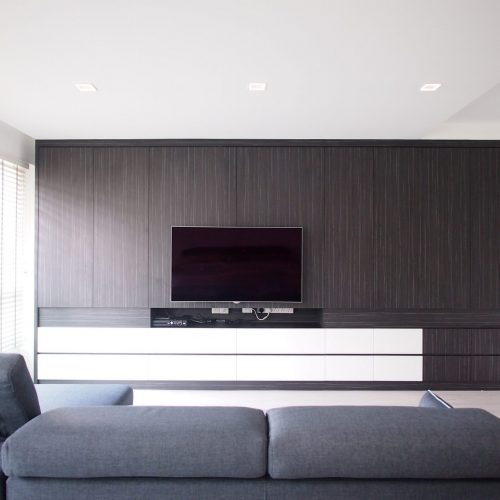
8. When designing the interiors, work with the principles that vertical lines draw our eyes up and horizontal lines draw them across to extend or reduce the proportions of each room. This can be done through carpentry or false ceiling designs.
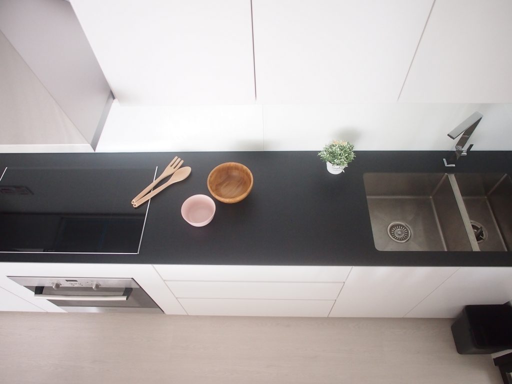
9. When planning for kitchen setup, ensure sufficient worktop space whenever possible. The whole kitchen experience could be a lot more user friendly if planning was done well and proper at the onset.
10. Borrow space from adjacent areas by ensuring an uninterrupted flow. One of the ways is to ‘borrow’ space from adjoining rooms by using the same flooring materials.
11. When furnishing rooms, visually disrupt the edges of the room by breaking up the lines between floor and walls; have built-in carpentry that are suspended; draw furniture a little way away from the walls; buy furniture in proportion to the room; choose furniture with legs to give the illusion of more space.
12. Ideas which seem ambitious initially to fit in a limited space may be possible with creative space planning solutions. Make use of recess walls and bay windows to your advantage. It is about making the best out of any situation.
The next step is to “Think Through” your space. You need to ask yourself certain questions that will help you understand the basic functionality of that space and how you can tweak its arrangement to suit your style and taste.
Questions like;
What is the space for and will it be multi-functional? E.g. living/dining or bedroom/study?
Can furniture be moved into or out of this room from other areas of the house?
How many people will be using the space and will they all be using it for the same purpose?
Do you have any existing furniture that you want to use in the space?
How do you want the room to feel, space-wise – open and airy, cozy, minimal, serene?
How much natural light is available and what kinds of lighting will be needed?
What are the focal points of the room and how can you take advantage of them?
Do you need to create focal points?
Do you like balance and symmetry, the unexpected, or a combination?
Is there anything else on your wish list for this room?
Are you looking to display certain objects in the room to be in sync with the eye level of the viewer?
Answers to these questions will help you highlight the problems that your space plan needs to solve. It may turn out that occasionally, you may need to compromise on some of the points.
“Having a good knowledge of built-up carpentry and space allowances are critical in doing good space planning.”
TL;DR
We believe in the power of people sharing information about things they care about. Apart from using the social sharing icons, readers may also republish our articles online or in print without any edits to the content. You just have to credit The Minimalist Society, and link to us with the specific article URL.
Like us on Facebook to see our latest portfolio.
The Minimalist Society is a brand that focuses deeply on purpose and social good for our society at large. We do so by crafting experiences that makes people’s lives simple through interior design. We have been featured extensively by renowned online portals, in print and on screen, such as The Straits Times, Business Insider, Lianhe Zaobao, The Business Times, Singapore Home and Decor, Lookbox Living, Houzz, Cromly, Qanvast, Vulcan Post, Yahoo and MM2 Entertainment Singapore. At Team Minimalist, simplicity is a goal, a work style, and a measuring stick. By leading a life of purpose, our home owners can embrace only on the things that will add to the mission of significance and ultimately living their best story.


