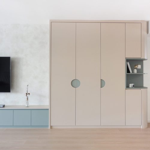
The Hidden Power of Colors in Interior Design
There are physiological factors behind colors that are chosen for interior design. Did you know that large brands are well thought out; every single detail is important in branding such as color. Color is just as important in interior design as in branding. Color affects moods and emotions and powerful tools that will help make your rooms in your house have different feelings: calm, cheerful, comfortable, etc. Simply by picking colors a space can even feel wider or smaller. It isn’t even always about the colors on the walls, it is how the furniture and accessories all go together.
Take a quick look at what each color means, so the next time you need to pick a color you can have a better understanding of what you want:
• RED: Red is considered the color of romance and passion. This can make one feel contemporary, traditional, or rustic. A touch of red can sometimes go well with a white room especially.
• PINK: There are endless shades of pink and each have their own mood. A bright pink typically is related to energy and glamour. A soft blush pink creates a soothing feeling. Depending on the color of pink, it can be paired with endless colors. Some colors that go great with pink are chocolate brown, gray, black and white.
• ORANGE: Many think that this color can be overwhelming. A deep orange color can be bold during the day and opposite in the evening. Sometimes colors can depend on the lighting in the room. Orange typically stimulates appetite therefore is a good idea to be in the dining room or kitchen.
• YELLOW: The color yellow adds optimism to your house this prompts feelings of happiness. It also stimulates memory or promotes communication. A sun-kissed yellow brings the thought of summer and hot in your house. A pale yellow can make the room feel and look larger than it really is. Yellow is a fun color when it is done correctly creatively.
• GREEN: Green represents growth and renewal. It is typically associated with the color of grass and leaves. It leaves a calming feel to the room. It comes in many shades and can create many moods.
• BLUE: Blue represents calm, freshness and strength. When we think of blue we think of the sky and ocean so it makes sense to think of those feelings! A high shade of blue, like a sapphire color, can add a bold feeling such as drama. A light sky blue can make one feel tranquil. A light blue color could be used in a bathroom or bedroom for relaxation.
• PURPLE: The color purple is associated with royalty and creativity. This can be a combination of exciting and exotic flair. It can be dramatic or quiet depending on the shade.
• GRAY: Gray relates to serenity and has an inherent calm sophisticated feeling. Sometimes a solid darker color symbolizes strength. Gray often complements other colors and is often used as neutral color. Most often gray is done in spaces like a den or office.
• BROWN: Brown encourages people to slow down and relax. It often is thought of with nature and natural materials. Brown gives the feeling of earth tones and richness that makes one feel invited.
Choosing the right colour scheme usually has no impact on renovation cost but is often the most neglected aspect in most interior design discussions. Color picking can be an overwhelming task in the design process but if done right, ideal palette can turn a blank slate and sensory-deprived house into a new appealing living space. Engage a designer who will be able to visualize the walls, the furniture, and emotions on your behalf. The end result will be a new home created with impact and dimensionality.
“Color picking can be an overwhelming task in the design process but if done right, ideal palette can turn a blank slate and sensory-deprived house into a new appealing living space. ”
TL;DR
We believe in the power of people sharing information about things they care about. Apart from using the social sharing icons, readers may also republish our articles online or in print without any edits to the content. You just have to credit The Minimalist Society, and link to us with the specific article URL.
Like us on Facebook to see our latest portfolio.
The Minimalist Society is a brand that focuses deeply on purpose and social good for our society at large. We do so by crafting experiences that makes people’s lives simple through interior design. We have been featured extensively by renowned online portals, in print and on screen, such as The Straits Times, Business Insider, Lianhe Zaobao, The Business Times, Singapore Home and Decor, Lookbox Living, Houzz, Cromly, Qanvast, Vulcan Post, Yahoo and MM2 Entertainment Singapore. At Team Minimalist, simplicity is a goal, a work style, and a measuring stick. By leading a life of purpose, our home owners can embrace only on the things that will add to the mission of significance and ultimately living their best story.